As the days draw in and the light slips into a softer register, there’s an urge to make rooms feel more cocooning. Enter harvest tones: ochre, tobacco and rust, colours that bring instant depth and a sort of grown-up warmth that’s far removed from novelty “autumn décor” (we’re not displaying gourds on the mantelpiece, here). ‘We use a lot of ochre in our schemes – Linwood’s Fools Gold from the Omega velvets collection is a go-to of ours,’ notes interior designer Georgie Wykeham. ‘It’s a really good grounding colour that adds warmth but doesn’t feel too autumnal.’
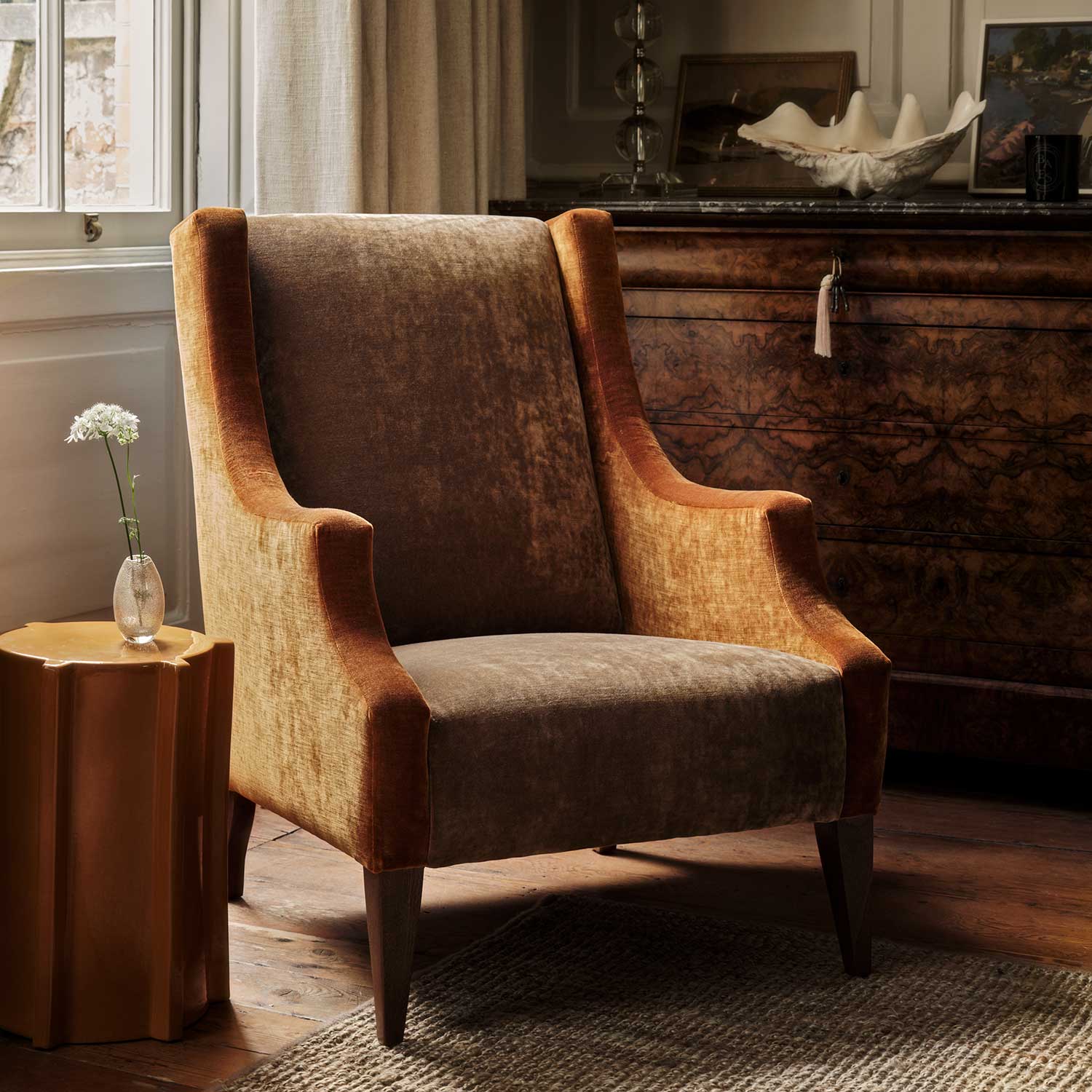
And that, indeed, is the point. These hues are the kind of classics that will look just as good in July as they do in the depths of November. Take this armchair in Cosmos velvet, upholstered in Spice and Pumpkin. It’s rich, chic, and absolutely not going anywhere once spring arrives.
The good news is that working with these warm tones is less about rules and more about instinct – layer them up, play with natural textures, and let them quietly elevate everything else. For anyone looking for interior design inspiration for the colder months, these hues are timeless, adaptable and completely transformative.
Nature’s Autumn Palette
 Ochre-hued velvet has a way of catching the light, radiating a golden warmth that feels like late-afternoon sun – case in point, this gorgeous sofa in Moleskin velvet in Gold. Rust upholstery fabric, meanwhile, has a marvellous way of grounding a scheme: deep, rich and reassuringly solid. Tobacco tones, the more mellow cousins of pumpkin spice shades, are the quiet heroes – endlessly adaptable and brilliantly grounding. ‘We tend to use a lot of colour in our schemes and we find tobacco tones brilliant for tethering the bolder shades,’ says Georgie Wykeham. ‘They’re really useful for taking things down a notch.’
The trick is to layer with intent. Think subtle contrasts: velvet with linen, wood with gloss paint, soft lighting pooling on natural materials. It’s this marriage of warm tones and cosy textures that makes a room feel pulled together rather than themed. These shades don’t shout; they simply make the room feel richer, softer and beautifully lived in.
Plain vs Patterned: Layering Warm Fabric Colours
Plains are the anchor in any scheme – subtle, dependable, and exactly what you need when you want your patterns to sing. They give the eye somewhere to rest, which means the stripes, florals or geometrics you layer in can make their point without overpowering. Take this rust-coloured armchair in Elba in Cayenne: it offers a warm foil to Taiki in River, a lively stripe in rust, olive and teal that adds a graphic lift, echoed in curtains made up in the same punchy print. You can play this trick anywhere: a tobacco velvet headboard paired with a floral featuring shades of ochre, say, or an umber-hued linen sofa offset by bold geometrics in earthy tones. Mixing plains with pattern creates balance; you get the warmth and depth of those harvest hues, with just enough rhythm and movement to stop a room feeling too safe. Sometimes, that balance is all a space needs – and this pairing does just that.
Our Top Design Picks
Upholstery: Warmth and Durability
 One of our favourite ways to bring harvest tones into a room is through upholstery, and here, we don’t just mean plains. A sofa in Dimity in Rust, with its russet bands and subtle detailing, shows how stripes can give even the most classic silhouette a bolder, more considered edge. It’s practical, too: linen wears beautifully over time, so you get comfort, durability and character in one go. In a world of throwaway trends, this is investment upholstery with texture and soul – tactile, timeless and quietly confident.
Curtains: Seasonal Drama and Drape
 Curtains are where you can afford to be quite brave, particularly if pattern has been put on mute elsewhere in the scheme. Pipili in Chickpea has all the storybook charm: playful, decorative, a touch eccentric, showcasing a gentle autumnal palette that will warm up even the coldest night. ‘It’s a truly joyful print,’ says Georgie Wykeham. ‘It’s whimsical without being childish, which means it can work in all manner of settings.’ Team with soft lighting and seasonal scents – think wood smoke, amber, or cedar – and suddenly the whole room shifts gear, becoming rich, inviting, and just the right side of decadent.
Cushions and Throws: Easy Transitional Updates
 If you’re not ready to commit to curtains or upholstery in these warming hues, cushions and throws are the cheat’s way in, spicing up a sofa or chair in seconds. ‘If there’s an autumnal colour a client loves but they’re nervous to use it, a cushion is the best place to start – it gives them that hint without the commitment,’ Georgie Wykeham agrees.
Take this cushion in Helter Skelter velvet in Paprika: bold enough to transform a relaxed beige linen armchair; chic enough to hold its own against a tailored chaise in teal velvet. This is the joy of a fine cushion or throw – an easy, accessible way to nod to the new season without the effort of a full redesign. A small soft furnishing detail, yes, but one that adds instant warmth, softness and the kind of cosy texture that makes you never want to leave the room.
Expanding the Palette: Moss Greens & Golden Browns
 Rust, ochre and tobacco are fabulous on their own, but they really sing when paired with other nature-inspired shades – think moss greens, golden browns, even a dash of mulberry. These lush green velvet cushions on a sofa in gorgeous antique gold velvet – Pickle and Oregano, both from the new Omega IV velvet collection – are a case in point: earthy yet vibrant, the sort of combination that makes you wonder why you didn’t try it sooner. Add in smoky blue walls, reminiscent of a stormy sky, and you have the perfect cocooning scheme that can easily be lifted when the days get lighter (think linens, jute, rattan…). It’s a palette rooted in nature that feels layered, calm and quietly luxurious.
Georgie Wykeham suggests introducing small surprises within the palette too: ‘A soft pink beside a chocolatey-brown gives lovely depth and texture,’ she says. ‘It’s those unexpected pairings that make a room feel layered and confident.’