As spring unfolds, there’s an irresistible urge to refresh our homes – to let in more light and embrace a sense of renewal by celebrating the surrounding natural world. And where better to start than with beautiful new window treatments? The right curtains or blinds don’t just frame a view; they soften light, add texture and bring a space to life.
Why Linen is Fabric of the Season
If there’s a fabric that truly captures the spirit of spring, it has to be linen. ‘We love designing linen window treatments because they have such a lovely feel and drape – there’s an effortless elegance to them,’ says interior designer Josie Lywood, co-founder of Q Design House. ‘They’re brilliant for creating a relaxed yet refined look, and it’s a bonus that linen is such a natural, sustainable choice.’
Indeed, linen’s eco-credentials are hard to beat. Derived from the flax plant – which thrives on rainwater alone – it’s biodegradable, breathable, and incredibly durable. Linwood’s latest collections, Dimity and Flori, celebrate all that makes linen special: a soft, organic texture paired with painterly botanical prints. Whether you’re drawn to the quiet sophistication of a stripe or the romance of an exuberant hand-painted floral, these fabrics offer a timeless way to dress your windows – not just for spring, but for years to come.
Dimity: A New Take on the Classic Stripe

There’s something effortlessly elegant about striped window treatments. ‘We love using stripes for curtains or blinds – they naturally draw the eye upward, making windows feel taller and grander, especially with floor-length curtains,’ notes Josie. Dimity takes this timeless motif and gives it a fresh twist, weaving in a delicate, botanical-inspired pattern that softens its structured design. ‘It has an organic feel that makes it particularly versatile. You can pair it with anything from florals to geometrics,’ Josie adds.
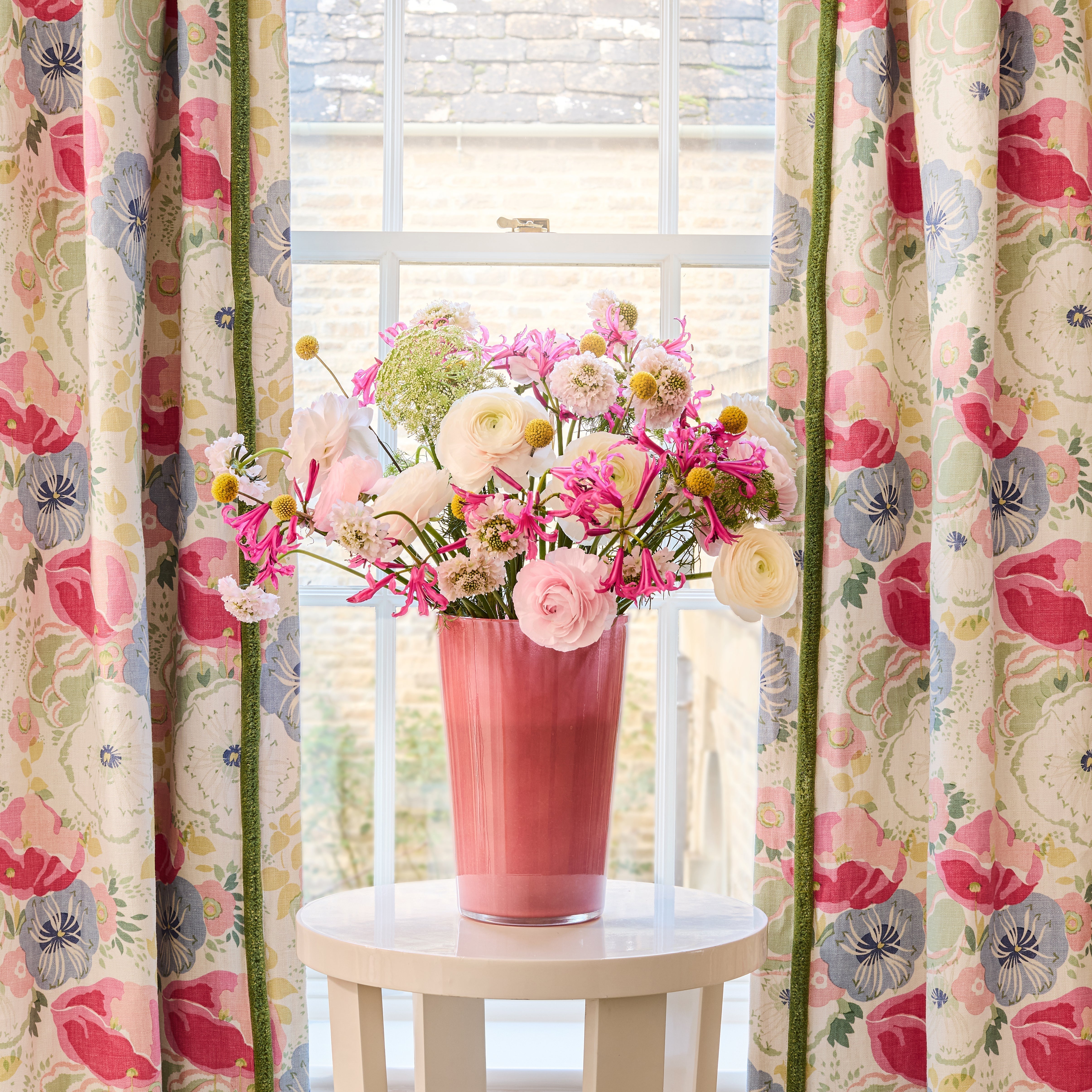
With no fewer than 19 colourways, there’s a Dimity for every interior, but this mouth-watering Mango version captures spring at its best: joyful, warm and undeniably fresh. At the French window, a full-length curtain lets the stripe take centre stage, softened by a ruffle in plain pink linen neatly finished with a trim of the stripe for a considered touch. At the other window, a Roman blind in the same plain linen is layered with a secondary blind, offering just a glimpse of the stripe. Proof that this lovely new print can be both a star player and a quietly grounding element.
Polly: A Painterly Botanical that Blurs Inside and Out

Framing a window with a lush green botanical is one of the easiest ways to blur the boundaries between indoors and out. ‘If you have trees or a lawn beyond, I find that the greens outside become more vivid and the same goes for the fabric; it somehow feels more alive,’ explains Josie.
Polly – shown here in Pastoral, one of five colourways – was originally hand-painted in soft, watery brushstrokes by the Linwood studio. It’s that painterly quality that gives it a playful charm, while the tonal palette keeps it soothing and sophisticated.
For this country bedroom, we chose full-length curtains, interlined for extra warmth, and let them fall just a touch long—a favourite trick of interior designers for creating a relaxed yet elegant feel. A finely detailed tonal trim adds subtle texture, enhancing the layered, inviting atmosphere of the space.
Polly Stripe: Sunshine in a Stripe

We are firm fans of a window seat – it offers not just an opportunity to create an extra perch but to draw attention to the window itself and layer in more fabrics for added depth and interest.
Here, gathered curtains in Polly Stripe – a lively sibling to our charming new Polly floral – frame the window beautifully. With its undulating, wavy design, the stripe feels fresh and modern while still nodding to tradition. Mimosa is one of the punchiest of the six colourways, and it is pure bottled sunshine: a joyful yellow tempered by a soft, stone-hued stripe that makes it surprisingly versatile. It slips effortlessly into neutral schemes, while the spice and teal tones add richness and provide plenty of inspiration for layered accents.
We picked up on those stronger tones with the window seat, upholstering it in teal wool, and adding a smart contrast with cinnamon-coloured piping that echoes the rust-hued cushion and blind. And for a final, considered detail? A trim of Polly Stripe on the blind – just enough to tie everything together without overdoing it.
Blythe: Subtle yet Striking

Blythe is one of those quietly brilliant botanical prints that every decorator should have in their arsenal. ‘I find a simple all-over pattern like this particularly useful in rooms where the curtains are open for much of the time, as the print still reads beautifully when the fabric is bunched up,’ says Josie.
With its stylised fern pattern and soft tonal palette, Blythe is the ultimate balancing act: gentle enough to temper bolder prints yet distinctive enough to add depth to a more restrained scheme. In this country house, Blythe in Raffia was used for full-length curtains at the French doors, paired with soft-fold Roman blinds at the windows flanking the fireplace—where curtains would have obscured the room’s lovely architectural details.
The print draws the eye to the windows and the views beyond, subtly lifting the space and injecting a breath of fresh air. Bands of velvet in a beautiful antique gold not only add a rich textural contrast to the linen but also introduce subtle definition, taking this understated room from effortlessly relaxed, to elegantly polished.
Lottie: Understated Elegance with a Folksy Feel

A subtle window treatment needn’t be bland—the key is to elevate curtains or blinds with an unexpected detail. Here, classic pinch pleat curtains showcase Lottie, a delicate botanical print inspired by honesty seed heads. The soft neutral Linen colourway pairs beautifully with the natural stone floor and timber dining table, creating a quietly harmonious backdrop.
A touch of braid along the top edge ties in perfectly with the red-painted chairs and side table, adding just the right amount of contrast. For a relaxed, folksy feel, we echoed the trim in a criss-cross detail at each pinch pleat—an understated yet charming touch that brings personality to the space.
Joni: A Joyful Floral that Steals the Show

Sometimes, a room simply calls for a blousy, joyful print—one that isn’t afraid to take centre stage. Joni is exactly that: a fresh reimagining of a 1930s block print, brimming with painterly florals and lush foliage. ‘I love using a busier fabric like this for curtains in rooms where upholstery is more pared-back – it allows the pattern to shine without overwhelming the space,’ explains Josie.
Here, curtains let Joni’s exuberant design unfold in all its glory. A slim band of olive-green velvet along the leading edge adds a thoughtful detail, subtly picking up on the green of the retro mirror frame. The result? A space that feels elegant yet effortlessly alive – like a garden in full bloom, all year round.
Order up to six free fabric samples today!